From zero to forty.
forty is about a train carriage full of strangers. About friends and family at a birthday party. And it’s about seeing the products we invented and designed in their hands. Claiming their rightful place in the lives of real people, because they solve real problems.
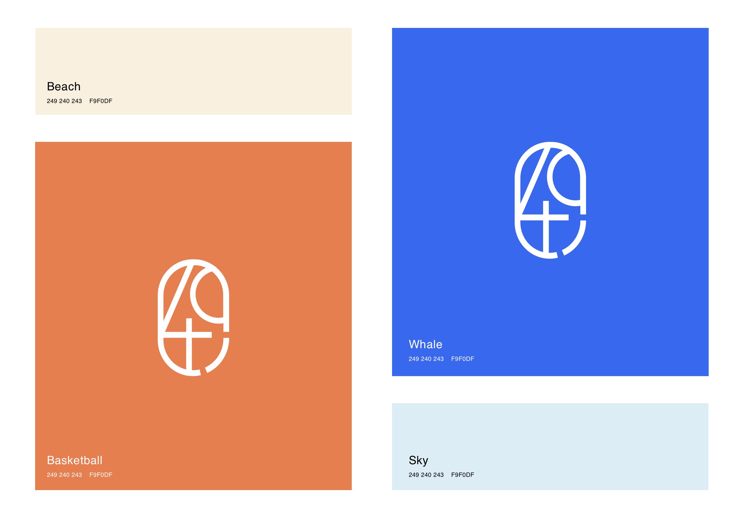
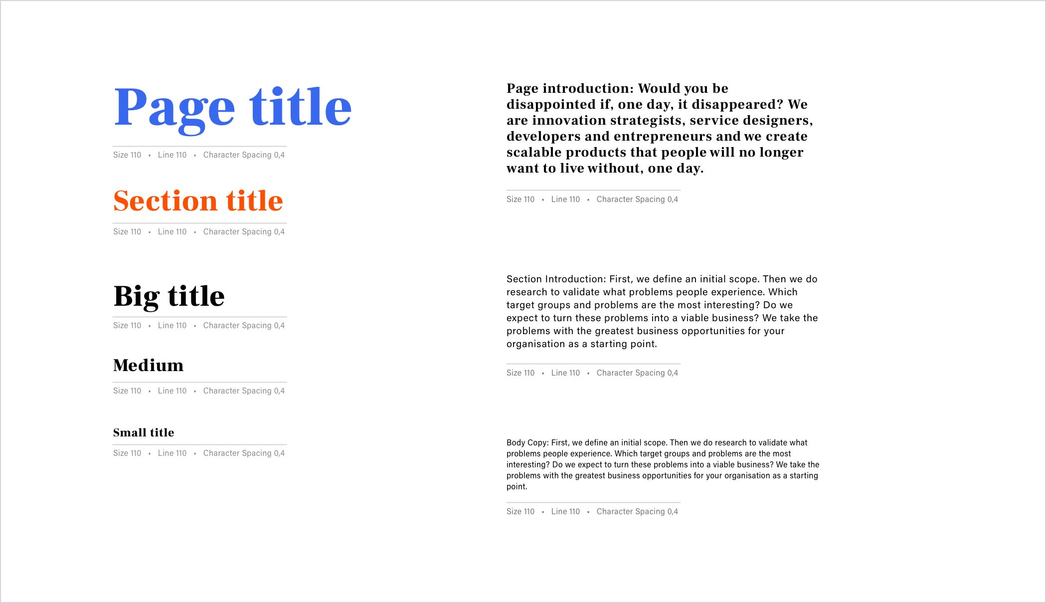
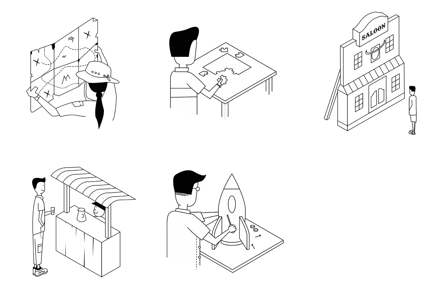
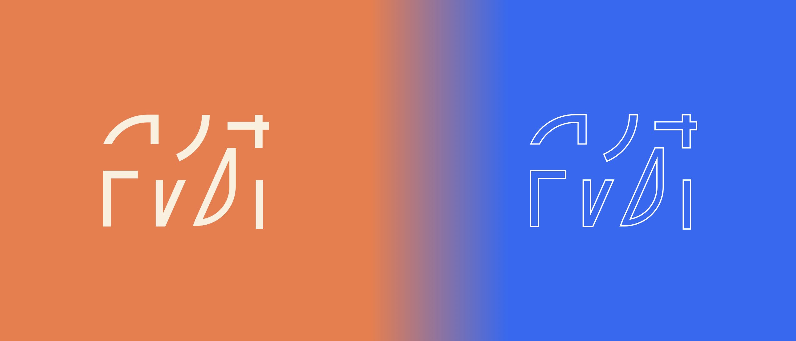
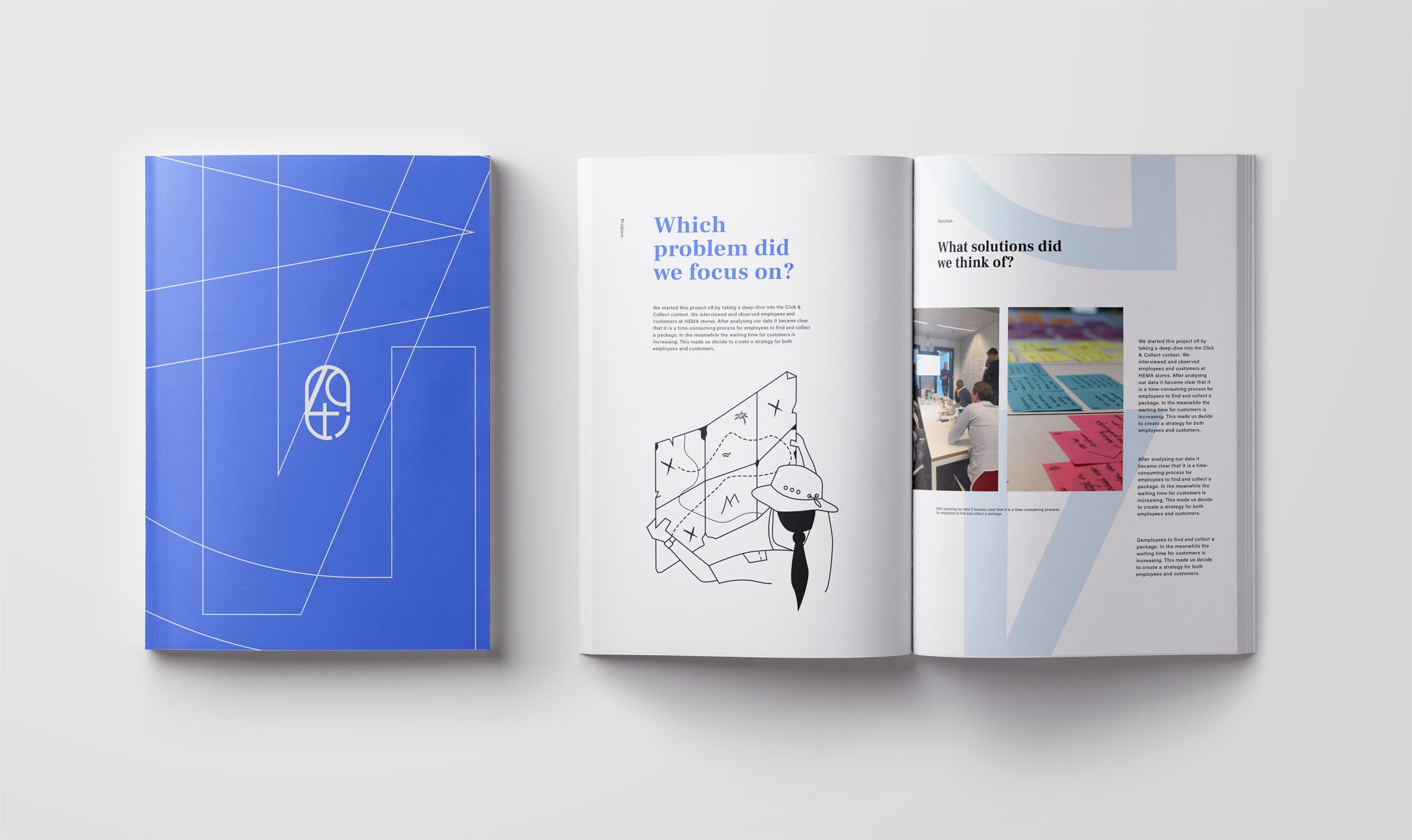
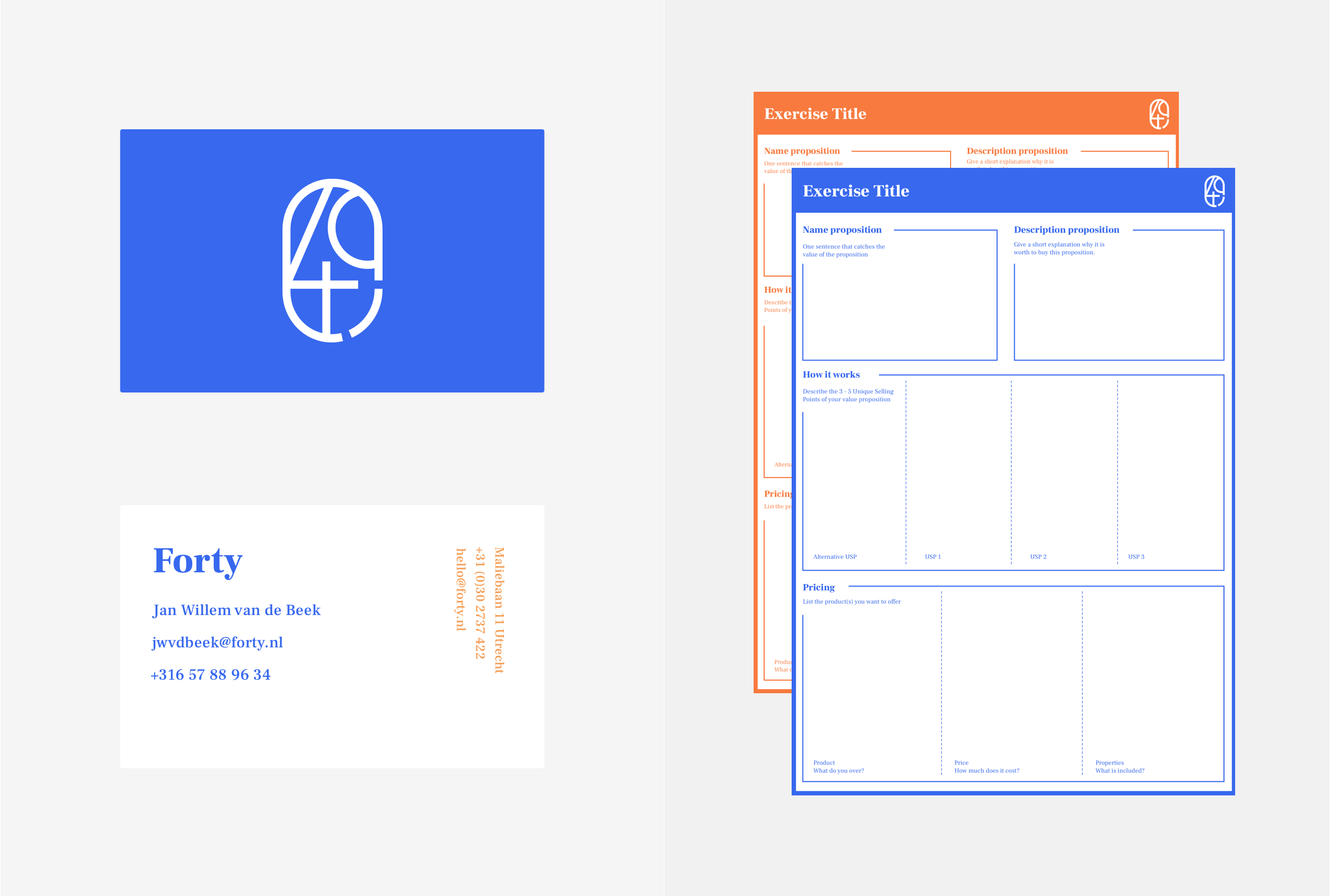
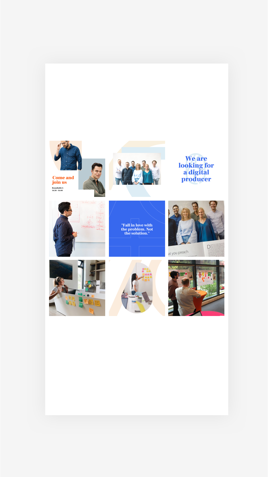
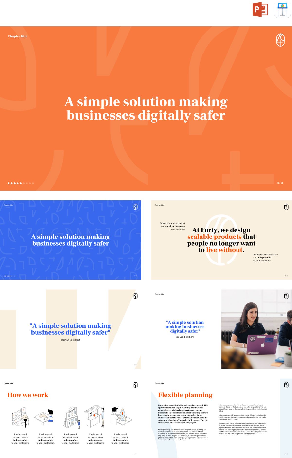
The challenge with any identity is to build a solid foundation that works offline and online. Forty approached me with the challenge to lay a foundation for their identity upon their already existing logo. I worked on building blocks by separating the logo into separate shapes. Representing the wide range of tools Forty works with in their unique process. Creating appealing patterns either filled or outlined. This makes the forty identity is playful, flexible, and cohesive. The identity principles can be easily translated from offline to online.
Branding, Illustration, Webdesign
Client
Forty
_Year
2020
logo design by Sarah Rakers
go to forty.nl

For freelance jobs, collaborations and other inquiries:
me@kevinkikkert.com • +31657889634
© 2022 Kevin Kikkert