Working on the design and implementation of new features in this year’s edition of the De Grote Speelgoed App. Focusing on improving KPI's while maintaining a fun, playful, and safe product for kids.
In a big covert operation, a brand new telco provider, Odido, was founded in 2023. I collaborated with James Hayter under the creative direction of Vincent Venema to develop the digital design direction for Odido, setting the foundation for its entire digital presence. This work guided and inspired other design teams, serving as the foundation for a design system that ensures consistent aesthetics and experience across over 100 digital touchpoints.

I led the redesign of a 15-year-old product to modernise the app and better meet today’s user expectations. We sent a questionnaire to the full user base and got 10,000+ responses. AI helped us sort and prioritize the feedback to guide key improvements and align them with business goals and technical needs. The result: a cleaner, more intuitive, clearer, and guiding experience with updated look & feel and enhanced accessibility.
Creation of the Digital Identity and UX Strategy Document for a (Confidential) AI driven Digital Platform as Part of ABN AMRO's New BEGIN Campaign.
I worked on the UI/UX design for the Greenchoice app, collaborating with Qikker Online and client stakeholders. The app, designed to promote energy efficiency, was iteratively refined over three years based on data and user feedback. It provides real-time energy usage data, solar investment insights, device-specific consumption analysis, and personalized dashboards. Users have achieved an average of 15% energy savings, thanks to features like energy-saving challenges and intuitive account management tools. The app is now discontinued, and all major features have been integrated in the web based client portal.
UI/UX
2016-2018
Qikker Online
100WEEKS empowers women in extreme poverty through 100 weeks of cash transfers and coaching, promoting economic independence and better living conditions. I worked with 100WEEKS to innovate and streamline their candidate selection and onboarding process. This digital transformation reduces paperwork, minimizes manual data entry, greatly decreases human input errors, and addresses technological barriers in remote African regions. The app is designed to be lightweight, functional, easy to use for users with limited literacy, and optimized for older devices with no/low connectivity. Its colorful, bold, yet simple interface ensures usability outdoors. This effort enables 100WEEKS to reach and support more women efficiently, without increasing administrative overhead.
UI/UX
2022
Collaborated with INDG and Daniel Sytsma to revamp the Harley Davidson Bike Configurator. My primary focus was on enhancing the user experience by ensuring seamless interactions and creating an intuitive, user-friendly interface. The project transitioned Harley Davidson from a picture-based web configurator to a photorealistic 3D digital reproduction.
UI/UX
2023
INDG
YIS (Yacht Information System) is an advanced luxury yacht infotainment system designed for comprehensive onboard enjoyment and management. Available as both a TV channel and an intuitive app, YIS offers a seamless user experience for yacht owners and guests. Features include real-time tracking of superyacht journeys, detailed mechanical information, and interactive content to enhance the luxury yachting experience. Developed to be user-friendly and accessible anytime, anywhere, YIS integrates high-end technology with maritime lifestyle needs.
UX/UI
2018
Medip Analytics is a pioneering startup in the medtech and biotech sectors. I collaborated with the founders to design an innovative software tool, organizing a comprehensive design process that included research and interviews to understand business and user needs. I facilitated presentations to distill insights and align design visions. I created both low and high-fidelity prototypes in Figma, bringing concepts to life. Additionally, I established a design system to enhance efficiency and consistency across the software, laying the groundwork for future applications.
UI/UX
2022
Global social media agency GoSpooky contacted me to design their brand-new website. The challenge was to complete the design within a few days and develop and launch it within three weeks, in time for the opening of their new office in New York.
UI/UX
2022
Led the design process for Safran's award-winning SOPHY App as part of their connected trolley program. The project involved conducting stakeholder interviews, creating flowcharts, writing user stories, and developing prototypes to design a user-centric application that integrates with Safran's global connected cabin strategy.
UI/UX
2021
Undagrid
Symetric is an advanced nautical information device designed for luxury yachts and boats, blending seamlessly with sophisticated interiors. This device can be mounted on walls or used as a free-standing unit, featuring a discreet information screen that displays essential nautical data. Developed in collaboration with Stefan v Cleef (industrial design) and Martin Bartels (hardware/software), Symetric was acquired by Yachtcloud in 2020. The product offers an elegant solution for integrating technology into high-end marine environments.
UX/UI
2020
Nickelodeon's Erecode is an interactive adventure app designed to complement the popular adventure show. The app engages kids with interactive questions and puzzles, allowing them to earn medals. Exclusive medals are unlockable only at the Efteling theme park, where the show is filmed. Collaborating with Superhero Cheesecake, I led the visual design, improved user experience (UX), and developed engaging animations to appeal to the target audience. The app enhances the show's experience by integrating a second-screen interactive element for fans.
UI/UX
Year: 2016

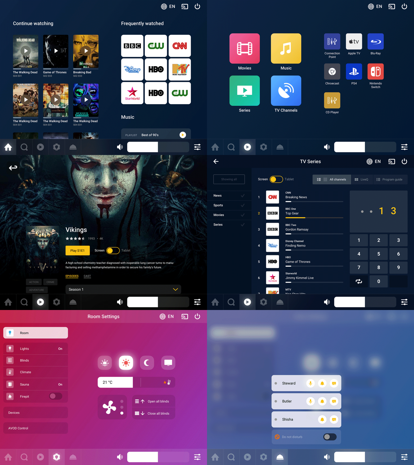
OMNIYON is an advanced media and control system designed for high-end environments. This cutting-edge solution integrates media and room control functions into a seamless, user-friendly tablet and mobile app. It unifies media management, room device controls, and service call functions within a single intuitive interface, providing a luxurious and streamlined user experience. In collaboration with Yachtcloud, I played a key role in redefining the user experience (UX) and visual design of OMNIYON. Through extensive wireframing, user feedback, and prototyping, we developed a completely new design optimized for various devices, including televisions, tablets, and mobile phones.
UX/UI
2018
Lifelinq is an innovative app designed to support individuals with reduced autonomy, enabling them to live safely and independently within their homes. During a three-month collaboration with Monitorlinq, I led the UX/UI design process to create a user-friendly and modern app experience. The design focuses on accessibility, simplicity, and engaging visuals, ensuring that users can easily navigate and interact with the app. This project sets a new standard for empowering individuals with technology and lays the groundwork for future product developments.
UX/UI
2015